The Look and The Feel x The Coca Cola Company


Partnerships Presenetation and Communications Design // 

$MM INTERNATIONAL B2B Marketing


Working with Atlanta agency The Look and The Feel, The Coca Cola Company was a joy to work with. One of the most influential companies in the world, collaborating with international organizations such as Sodexo France and internal brands such as Powerade, Sprite, Fanta, Gold Peak Tea and more. Mostly confidential, supporting brand asset creation still used today, working amazing sales teams with demanding schedules and alignments, even getting to touch their philanthropic branch, all under an agency umbrella – I’m very proud of the brand and layout work I was able to bring as an Atlanta native. 

POWERADE 2022


Typography // Internal Communications // Seasonal Launch

POWERADE 2022


Typography // Internal Communications // Seasonal Launch


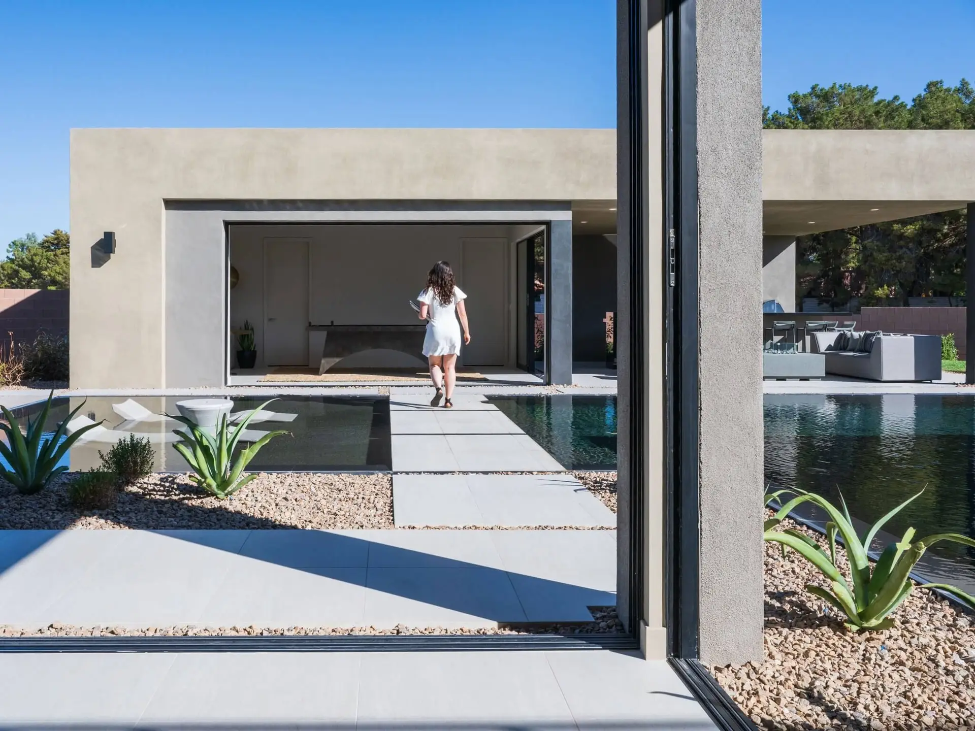
An Oasis of luxury Homes
in the Las Vegas Valley


OASI BRAND DESIGN // OMNI-CHANNEL DESIGN // ILLUSTRATION // LAYOUT // ASSET MANAGEMENT


A six month sprint to launch an omni-channel campaign for three sub-brands – while designing one (Oasi) from scratch – for Blue Heron Homes. Working within strict overarching brand guidelines, sub brand execution was sharp and specific. Our primary challenge was navigating the delicate balance of upholding a luxurious brand profile of a custom builder, but now for spec homes.   As designer heading the project, alongside the AFMKTG team, we were able to execute a $MM luxury real estate brand launch. 

Modern Lines, Modern Homes.


Founding Designer
back when it was big tent,
not centrist,

+ circa 2022*

A three way merger, two sides of the spectrum, and one design team. The idea? Coming together, going Forward.

brand + sub-brand identity // brand systems management // visual strategy

While centrist today, the Forward Party, when launched, was a three-way merger of the largest voting and party reform NGOs in the USA – Serve America Movement, Renew America Movement, and The Forward Party. Anti-trump republicans, reform-based democrats, and passionate revolutionaries going up against the two-party system – my job was to create a visual identity in which they and their audiences could see themselves. Historic research and deep dives created a balance of red and blue (*no purple); impactful, sharp type; and easy-going under currents in the accents. The three orgs’ teams came together to pull off an amazing launch – in less than 48h, catapulting the new brand’s audience a cumulative +145% above and beyond (and, of course, forward).

The idea?
Coming together, going Forward.

brand + sub-brand identity // brand systems management // visual strategy

While centrist today, the Forward Party, when launched, was a three-way merger of the largest voting and party reform NGOs in the USA – Serve America Movement, Renew America Movement, and The Forward Party.

Anti-trump republicans, reform-based democrats, and passionate revolutionaries going up against the two-party system – my job was to create a visual identity in which they and their audiences could see themselves. Historic research and deep dives created a balance of red and blue (*no purple); impactful, sharp type; and easy-going under currents in the accents.

The three orgs’ teams came together to pull off an amazing launch – in less than 48h, catapulting the new brand’s audience a cumulative +145% above and beyond (and, of course, forward).

An ambitious brand for an ambitious message.

METRO

by T-Mobile

An internal agency turning heads across the country

T-MOBILE • METRO • CONNECT • WALMART • AMAZON • APPLE

Helping contribute to “the most aggressive prepaid market leader in North America during 2024” ¹, I was privileged to work on some of Metro by T-Mobile’s largest campaigns, including the viral NadaYadaYada activation, multi-lingual campaigns aligning English, Spanish, and Mandarin layouts, and quarterly refreshers for over 4000 Walmart retail displays. Creating reusable assets, aligning with strict identity rules, and communicating with stakeholders – from higher-ups to external collaborators – I can confidently day that at Metro there’s NadaYadaYada – just great graphic design.

* Some Color Variation Shown due to asset’s CMYK profile

Retail

Activations

Out of Home

Brand Campaings

Multi-Lingual Layout

Ad Animation

... For the Top Promotions in American Telecom

Displays in Over 4000 Walmart Stores and
8000 Metro Stores Across America

Displays in Over 4000 Walmart Stores and 8000 Metro Stores Across America

Modern Smart Lockers


Bold, punchy, fun. This brand is modernizing the smart locker experience. Forget your old high school lockers, these are cutting-edge pieces of interactive technology and design.

Agency Designer with OneDayOne Marketing

Brand systems // web and layout

Before 2024 the Modern smart lockers brand teetered between sleek an bold, until 2025 when brand auditing and systems brought us back to Modern. Building up client profiles and new offerings, alongside balancing ever-changing hierarchy levels and photography styles. The Modern Smart Locker brand moves different directions: not with the wind, but with specific intention to who will see the design. The output of this project is a fully re-built identity, a full repository of over 50 web pages and CTAs, Layouts, education presentations and, most importantly, beautiful lockers.

Bold lockers. Bold strategy. Bold brand.

I've been designing for brand and marketing for over eight years

Lorem ipsum dolor sit amet, consectetur adipiscing elit, sed do eiusmod tempor incididunt ut labore et dolore magna aliqua. Nibh praesent tristique magna sit amet

empor incididunt ut labore et dolore magna aling elit, sed do eiusmod tempor incididunt ut labore et dolore magna aliqua. Nibh praesent tristique magna sit amet purus. Odio ut sem nulla pharetra diam sit amet nisl. Facilisi cras fermentum odio eu feugiat. Aenean sed adipiscing diam donec. Diam volutpat commodo sed egestas. Et ligula ullamcorper malesuada proin libero nunc consequat interdum varius.